To make their books as accessible as possible to readers—and to capitalize on sales opportunities—we encourage our authors to consider both e-book and print formats, since some readers may prefer one format over the other. Each book needs to be handled as an individual and unique body of work, and the process by which that book is made available to readers differs depending on the chosen publication format.
As a published author, you want your work to reach your readers in as professional and appealing a package as possible, and that means being aware of the technical differences in these formats. Simply put, popping your e-pub file over to the printer won’t miraculously give it the professional, cohesive appearance of a typeset-for-print book when it rolls off the press. Alternatively, merely having your print file converted directly to an electronic format will produce an ebook that not only lacks the features of a professionally created ebook, but will be far less readable. Each book format needs to be treated as an individual component and given the professional attention it deserves.
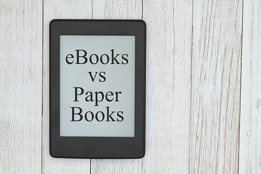
Epub versus Print
There are a number of basic differences between electronic books (e-books) and print books. The most obvious is that the e-book text is fluid and reflowable, not static like a printed book. The way an e-book book presents is based on the settings available on the reader’s device and the size of the actual device display. The e-pub file (source file format for most e-readers) is simply a generic text-based file that will be uploaded or copied to the device, whether it’s a Kindle or similar reader, a tablet, a smartphone, or even a laptop or desktop computer. Whereas a print book file can easily converted to e-pub, a print file requires additional elements like running footers, page numbers, and so on that an epub doesn’t require. These elements must be incorporated into a print file in order to form a cohesive, industry-standard volume.
When setting up the e-pub file, one cannot pre-determine the typeface, font size and spacing, page breaks, etc. These elements are all determined by the device settings—text will change appearance and size, reflowing based on those settings. E-books will also present differently on each device, and change if the window size changes as well (if viewed on a laptop or computer monitor). Most devices can be read in landscape or portrait mode and even allow you to change the number of text columns, all affecting the “pagination” of the text.
The overall goal of setting up a proper e-pub file is to produce a file that is readable and appropriate for the maximum number of devices upon which it could be viewed. Therefore the more “generic” the setup, the more devices will be able to present the reader with a clean, well-formatted, and readable e-book.
The overall goal of setting up a proper e-pub file is to produce a file that is readable and appropriate for the maximum number of devices upon which it could be viewed. Therefore the more “generic” the setup, the more devices will be able to present the reader with a clean, well-formatted, and readable e-book.
Checking Your E-pub File Prior to Publication
The best way to check your e-book is to view it in an e-pub reader app like Calibre, Adobe Digital Editions, iBooks, Freda, Icecream, etc., all available for download online or from your favorite app store. Since the file will look different depending on the device used, there are fewer items to check than in a printed book. There won’t be page static numbers in an e-book, and the running heads (if present) will be automatically based on the book’s title.
First, make sure the fonts are applied consistently based on your original manuscript or print version of the book; if text is supposed to be bold or italic, it should be the same bold and italic in each appearance but still match the roman font style (Times, Arial, etc.). Heads and subheads should be consistently applied as well, and all chapters should start on a new page. Don’t worry about how the actual running text breaks from paragraph to paragraph or page to page (widows, orphans, loose lines, etc.)—that’s going to be different for every device and setting. Hyphenation in an ebook is either on or off and, again, dependent on the device and/or user settings.
Check your table of contents by clicking each link to make sure it is active and correct. Do the same with exterior links to URLs and interior links like “page” references or footnotes/endnotes. If an e-pub file is correctly prepared it should contain a multi-level table of contents, a sidebar contents listing that allows a reader to jump to another chapter without needing to go back to the book’s actual contents page.
Last, if your file contains images, make sure they are consistently sized (if applicable) and are crisp and clear. Some e-book readers will allow the image to be double-clicked to isolate it and render it expandable. Images should ideally be able to resize with the text column width, window, or device. Images in e-pub files cannot “wrap” to the text and can only be placed between text blocks (paragraphs or heads/subheads).
Typeface-specific elements like logos and title page (usually based on the cover) need to be placed as images in order to maintain their print-based appearance. Charts and diagrams also need to be placed as images. If tables are set up in automatic mode in the original file (Word or InDesign, for example), they will show up as tables in the e-book, but it’s hit or miss on how the columns will present. Since tabs and extra returns do not register in the e-pub format, the text must be formatted with extra paragraph spacing and indents as required.
Recent Comments